Minimalist Logo Styles 2026: Less is More, But Make It Meaningful//
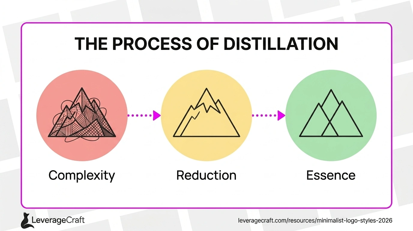
The Evolution of Minimalist Logo Design//
Minimalism in logo design has reached new levels of sophistication in 2026. What began as a reaction against complexity has evolved into a refined art form that communicates maximum meaning through minimal elements.
Today's minimalist logos aren't just simple—they're strategically simplified, with every line, curve, and space serving a specific purpose. This intentional restraint creates logos that are memorable, versatile, and timeless.
Core Principles of Minimalist Logo Design//
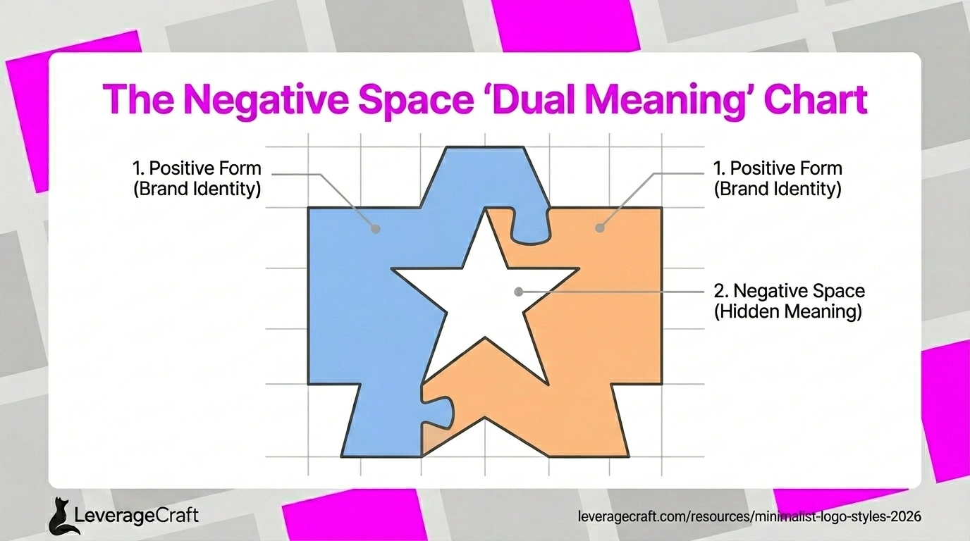
Effective minimalist logos follow several key principles: essential reduction (removing everything non-essential), geometric precision (using clean shapes and exact angles), negative space mastery (making emptiness work as hard as form), and perfect balance.
The goal isn't to make logos small or plain—it's to distill them to their purest, most powerful form. Every element that remains must justify its presence.
Geometric Minimalism//
Geometric minimalism uses basic shapes—circles, squares, triangles—as building blocks. These fundamental forms create instant recognition and work flawlessly at any scale.
The 2026 approach adds sophistication through subtle proportional relationships, golden ratio principles, and unexpected combinations that create visual interest while maintaining extreme simplicity.
Minimalist Letterform Logos//
Letterform logos reduce company names to single letters or monograms executed with typographic excellence. This style requires exceptional attention to letterform details, spacing, and proportions.
Modern letterform logos often incorporate subtle geometric modifications or optical adjustments that make them distinctive without sacrificing legibility. The refinement lies in microscopic decisions that create perfect visual balance.
Mastering Negative Space//
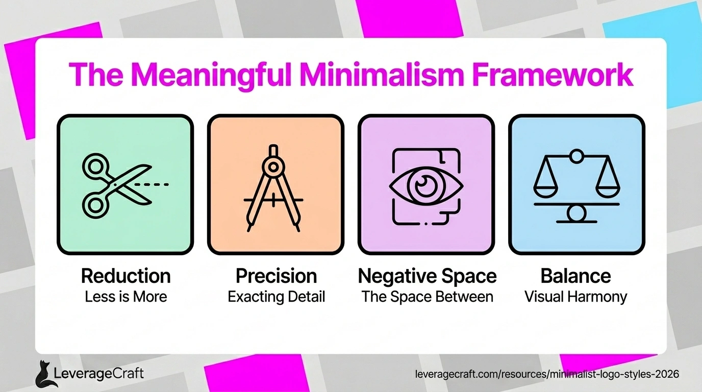
The most sophisticated minimalist logos use negative space as actively as positive space. Hidden symbols, dual meanings, and clever visual plays emerge from the relationship between form and emptiness.
This technique creates logos that reward closer inspection, building deeper brand connections as viewers discover hidden layers of meaning. The FedEx arrow and NBC peacock represent classic examples, while 2026 designs push this approach further.
Line Art and Stroke-Based Design//
Line art logos use continuous or carefully composed strokes to create forms. This style feels modern, elegant, and sophisticated—perfect for premium brands and technology companies.
The challenge lies in achieving the right stroke weight—thick enough to reproduce cleanly but thin enough to feel refined. Variable stroke weights can add subtle dynamism while maintaining minimalist principles.
Minimalist Color Application//
Minimalist logos typically use one or two colors maximum, often with a strong monochrome version as the primary logo. This restraint ensures versatility and reduces reproduction costs.
When color is used, it becomes incredibly powerful because there's nothing else competing for attention. Single-color gradients, duotones, or carefully chosen accent colors create impact without violating minimalist principles.
Implementing Minimalist Design//
Creating minimalist logos requires starting complex and systematically removing elements until you reach the essence. Ask of each element: "What happens if I remove this?" If the answer is "nothing important," remove it.
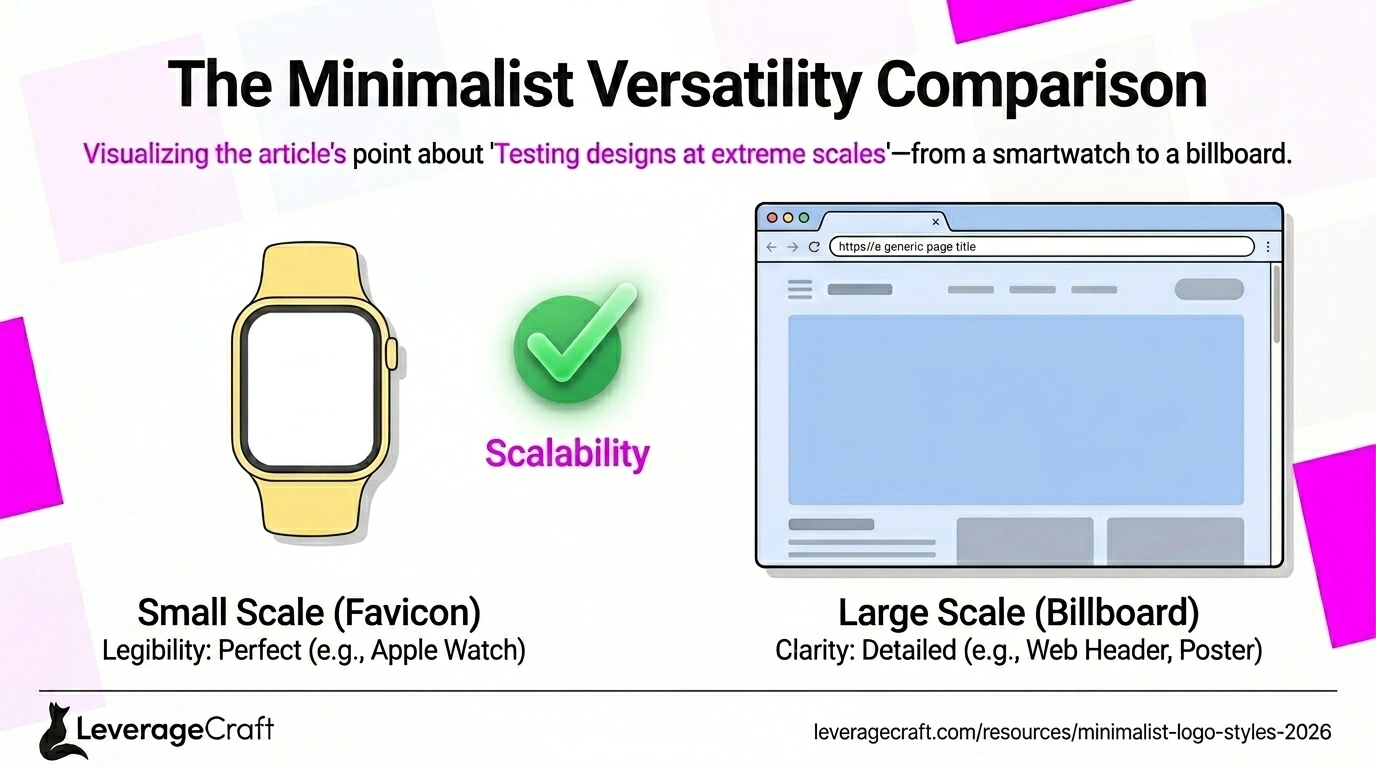
Test your designs at extreme scales—both tiny (favicon size) and huge (billboard size). Minimalist logos should work flawlessly at every scale, maintaining clarity and impact whether viewed on a smartwatch or a building.
FREQUENTLY ASKED QUESTIONS//
Can minimalist logos work for any industry?
Yes, minimalism is universal. The key is adapting the approach to fit your industry context. A minimalist logo for a law firm might use classic geometric forms and serif typography, while a tech startup might choose modern sans-serifs and abstract shapes. The minimalist philosophy applies everywhere.
How do I avoid making my logo too generic through minimalism?
Focus on distinctive proportions, unique geometric relationships, or clever negative space usage. Even within minimalist constraints, infinite variations exist. Small details—the exact curve of a line, specific angles, or particular proportions—create uniqueness without adding complexity.
Is minimalist design just a trend?
While minimalism has trendy moments, it's fundamentally a design philosophy rooted in functional clarity. Minimalist logos from the 1960s remain effective today because good minimalism is timeless. The style evolves, but the principle of essential reduction endures.
RELATED ARTICLES//
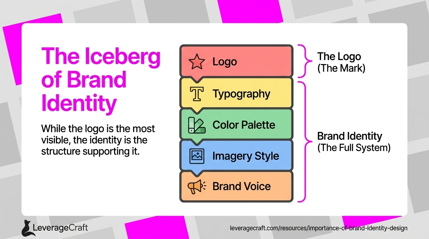
The Importance of Brand Identity Design in 2025
Discover why a strong brand identity is crucial for business success and how it influences customer perception, loyalty, and market positioning.
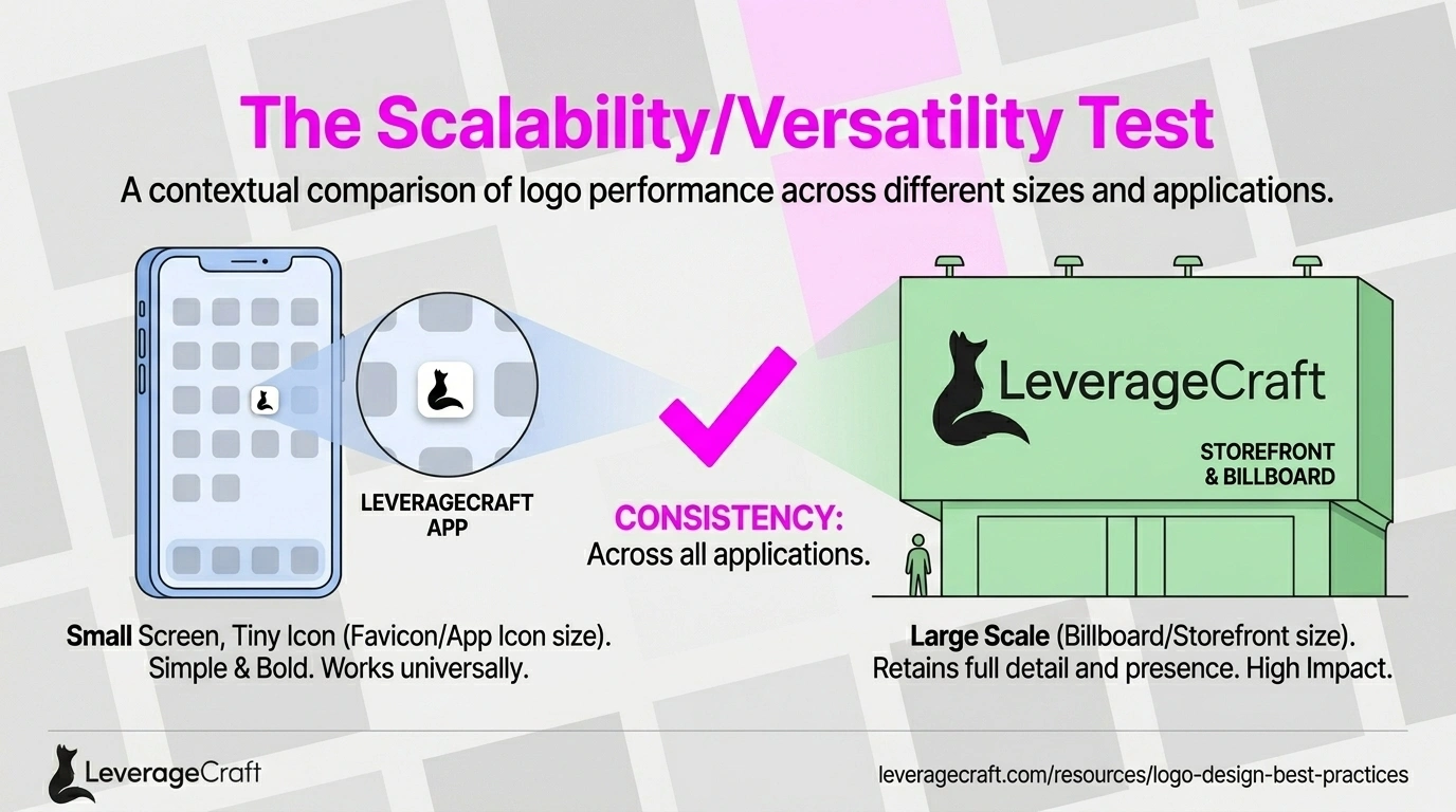
Logo Design Best Practices: Creating Timeless Brand Marks
Master the fundamentals of effective logo design with proven principles that create memorable, versatile, and timeless brand marks.

Website Design Trends Shaping 2025
Explore the latest website design trends, from AI-powered personalization to immersive 3D experiences, and learn how to implement them effectively.