Responsive Design Patterns 2026: Beyond Mobile-First to Context-Aware//
Evolution of Responsive Design//
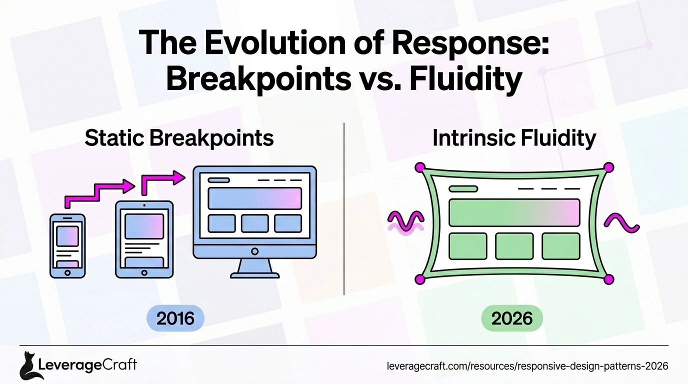
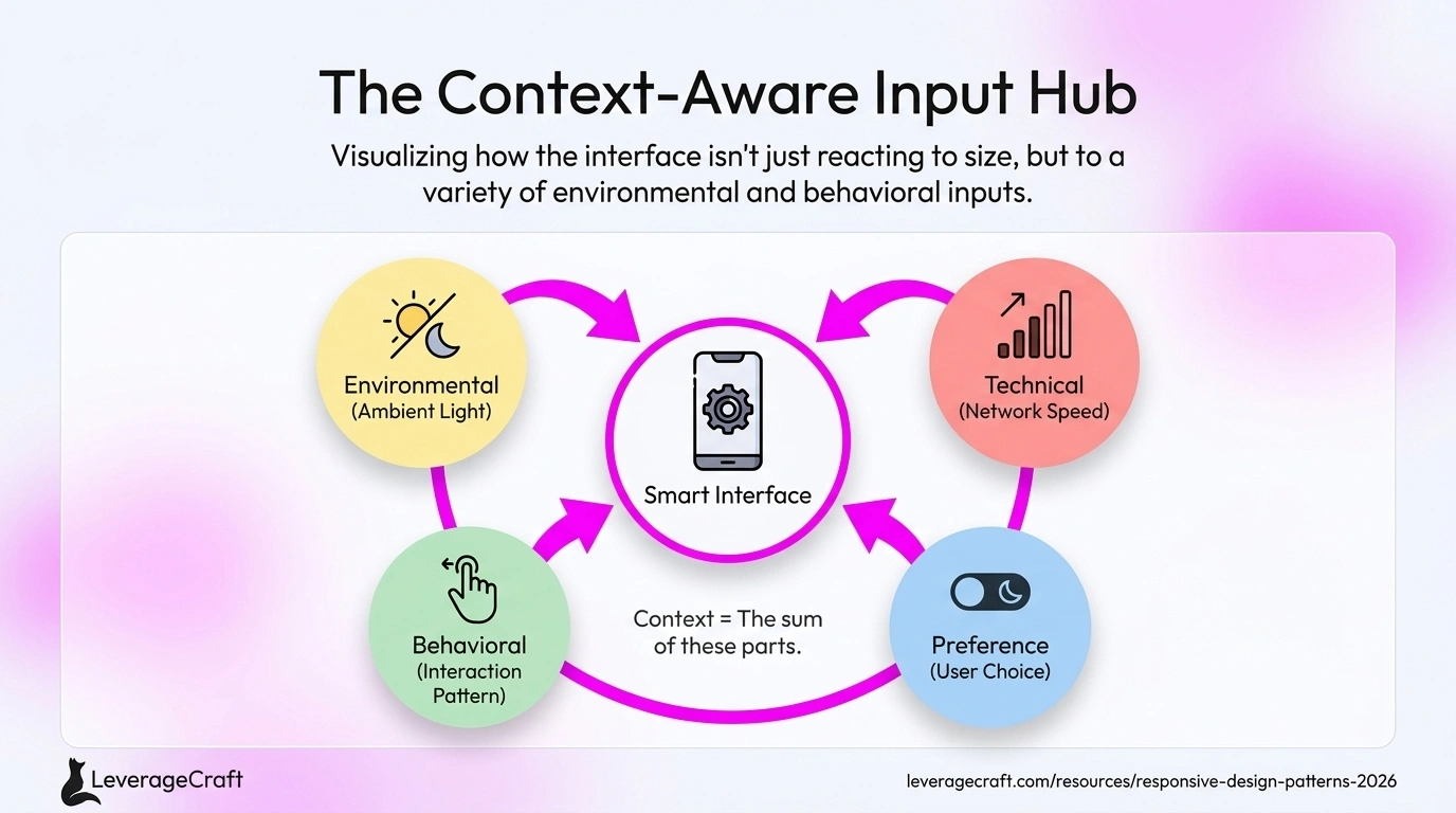
Responsive design has evolved far beyond simple breakpoints and fluid grids. In 2026, websites adapt to screen size, device capabilities, network speed, user preferences, ambient light, motion, time of day, and behavioral patterns. This context-aware responsiveness creates experiences that feel intelligent and considerate.
Google, Apple, and Microsoft lead this evolution with interfaces that sense context and adapt accordingly. Their design systems respond not just to device dimensions but to how and where people use technology—different layouts for tablets on laps versus desks, interfaces that adjust for one-handed phone use, and experiences that shift for indoor versus outdoor viewing.
Fluid Everything: Beyond Fixed Breakpoints//
Traditional responsive design used 3-5 breakpoints (mobile, tablet, desktop). Modern responsive design is continuously fluid—every element scales smoothly across the full spectrum of viewport sizes. Container queries allow components to respond to their parent container, not just the viewport.
Intrinsic design principles, popularized by Jen Simmons, let content dictate layout rather than imposing artificial breakpoints. Typography scales with viewport units, spacing adapts proportionally, and layouts flow naturally without abrupt jumps between sizes.
Device Capability-Based Adaptation//
Devices vary dramatically in capabilities beyond size—processing power, touch support, stylus input, keyboard availability, camera access, and network speed. Modern responsive design uses feature queries to provide appropriate experiences for each capability set.
Netflix serves different video qualities based on network speed and device capabilities. Adobe's web apps offer simplified interfaces on lower-powered devices. LinkedIn adapts interaction patterns based on whether users have keyboards, touch screens, or both.
User Preference Adaptation//
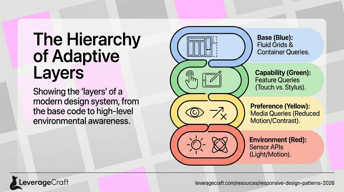
CSS now supports media queries for user preferences: prefers-color-scheme (dark mode), prefers-reduced-motion (animation sensitivity), prefers-contrast (high contrast needs), and prefers-reduced-data (bandwidth conservation). Respecting these preferences isn't optional—it's accessibility and user respect.
Apple's system-level preferences cascade across all web experiences. Users set dark mode once, and every well-designed website respects it. This creates consistency and shows that websites care about user needs, not just designer preferences.
Behavioral Responsive Patterns//

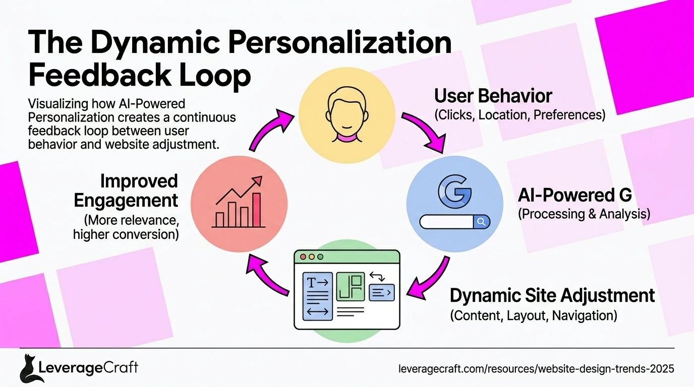
Advanced responsive design adapts to behavior: interfaces that adjust based on scroll speed, layouts that change based on interaction patterns, navigation that appears proactively when users seem lost, and CTAs that emphasize based on engagement signals.
Amazon's interface responds to browsing patterns—showing different layouts for browsers versus buyers, adjusting information density based on user confidence signals. This behavioral responsiveness feels intuitive because it matches how users naturally work.
Environmental Context Awareness//
Ambient light sensors allow websites to adjust contrast for outdoor viewing. Time-of-day awareness enables appropriate defaults (dark mode in evenings). Location context adapts content relevance. Motion sensors detect whether devices are stationary or moving, adjusting interaction complexity accordingly.
Google Maps increases tap target sizes and simplifies navigation when sensors detect users are walking or driving. Reading apps boost contrast and reduce blue light in evenings. These environmental adaptations create experiences that feel context-appropriate.
Modern Responsive Component Patterns//
Key patterns include: fluid type scales (typography that adapts smoothly), aspect ratio containers (maintaining proportions across sizes), clamp-based spacing (min-max constraints with fluid scaling), grid auto-fit (columns that adapt without breakpoints), and stack-to-sidebar (automatic layout shifts).
CSS Grid and Container Queries enable sophisticated layouts with minimal media queries. Components become self-sufficient—adapting to their context rather than requiring global breakpoint management. This modularity makes design systems more maintainable and flexible.
Performance-Based Responsiveness//
Network-aware design loads critical content first, defers non-essential elements on slow connections, and progressively enhances as bandwidth allows. The Network Information API enables websites to adapt to connection quality—serving low-res images on 3G, high-res on fiber.
Facebook pioneered this with their 2G Tuesdays—testing products on extremely slow connections. Their responsive strategy prioritizes content loading, showing text instantly while images load progressively. This performance responsiveness ensures usability across global connectivity disparities.
Testing Context-Aware Responsiveness//
Testing modern responsive design requires simulating multiple contexts: various viewport sizes, device capabilities, network speeds, user preferences, and behavioral patterns. Tools like Chrome DevTools now simulate preference queries, throttle network, and emulate device characteristics.
Comprehensive testing includes real devices (not just simulators), diverse user testing (different abilities and preferences), automated accessibility testing, and analytics review to identify where responsive design fails in the wild. Context-aware design requires context-aware testing.
FREQUENTLY ASKED QUESTIONS//
Is mobile-first still relevant in 2026?
Yes, but evolved. Start with mobile constraints to ensure core functionality works everywhere, but think beyond size to capability, context, and behavior. Mobile-first is now context-first—considering the full range of how, where, and why people use your website across all situations.
How do I balance personalization with privacy?
Use device APIs and browser-level preferences that don't require tracking. Prefer CSS media queries (prefers-color-scheme, prefers-reduced-motion) over JavaScript tracking. When personalization requires data, be transparent, get explicit consent, and provide clear opt-out. Many effective adaptations—like network-aware loading—don't require any personal data.
Do these advanced patterns work with older browsers?
Use progressive enhancement—provide solid baseline experiences for all browsers, then enhance for those supporting advanced features. Container queries, preference media queries, and modern CSS fall back gracefully. Test with real devices and analytics data to ensure your baseline experience reaches your actual audience.
RELATED ARTICLES//
The Importance of Brand Identity Design in 2025
Discover why a strong brand identity is crucial for business success and how it influences customer perception, loyalty, and market positioning.

Logo Design Best Practices: Creating Timeless Brand Marks
Master the fundamentals of effective logo design with proven principles that create memorable, versatile, and timeless brand marks.
Website Design Trends Shaping 2025
Explore the latest website design trends, from AI-powered personalization to immersive 3D experiences, and learn how to implement them effectively.